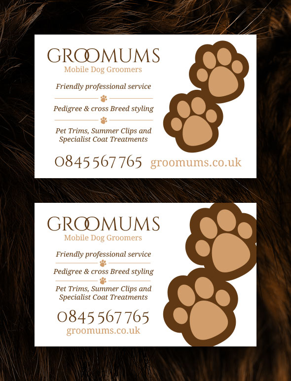
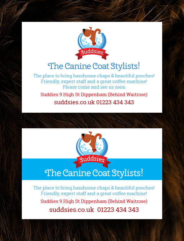
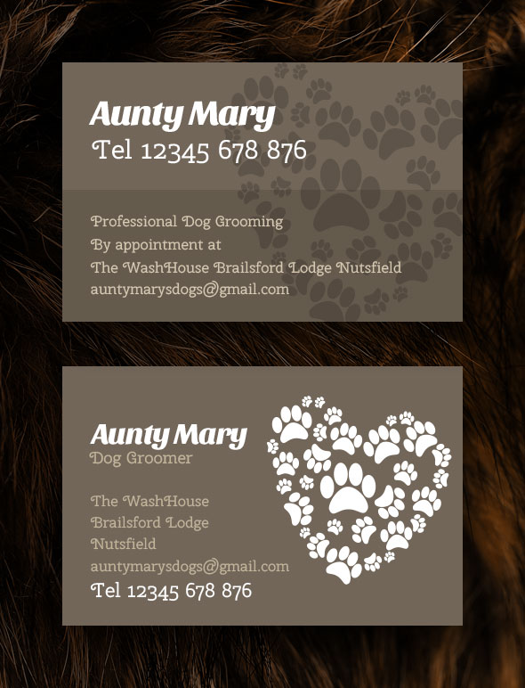
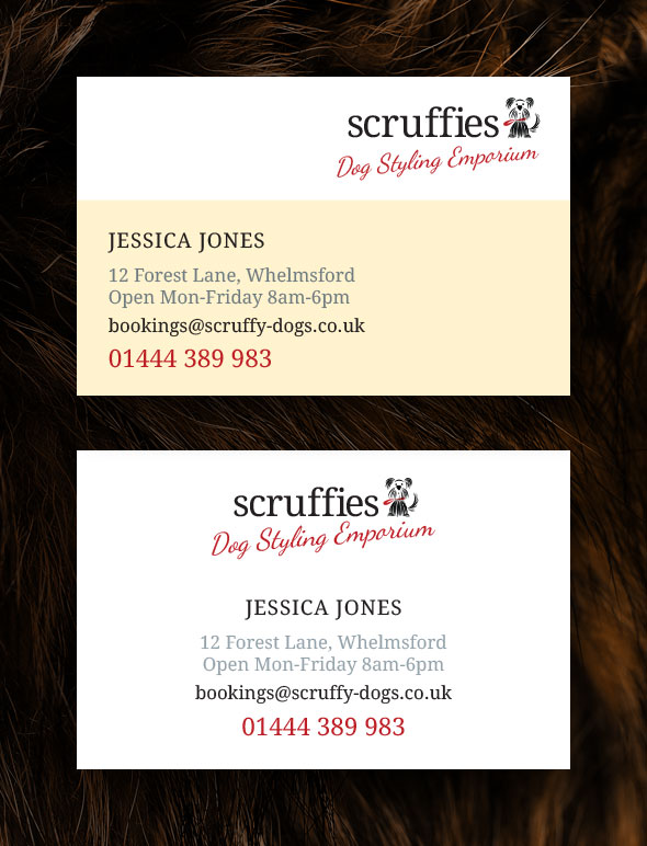
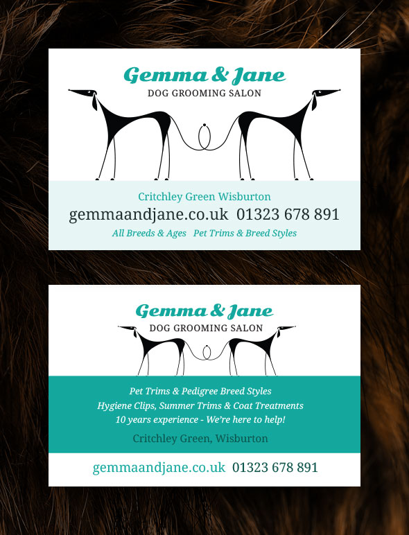
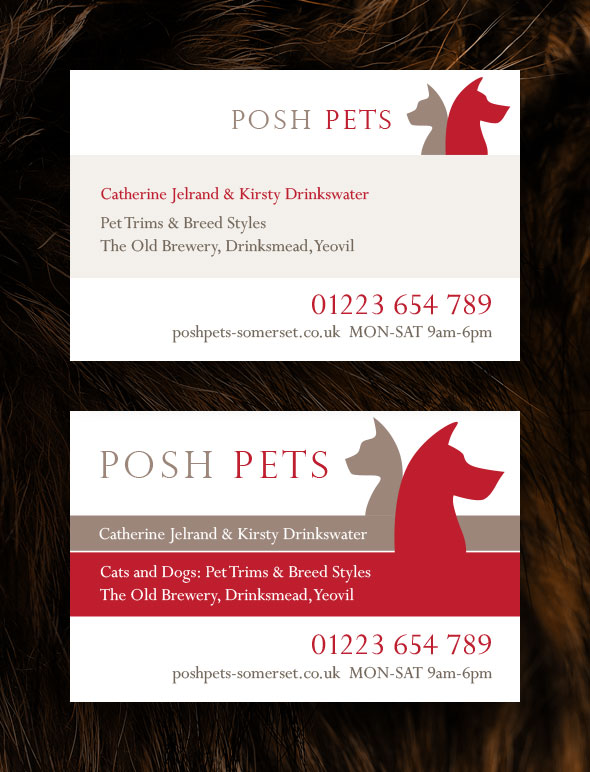
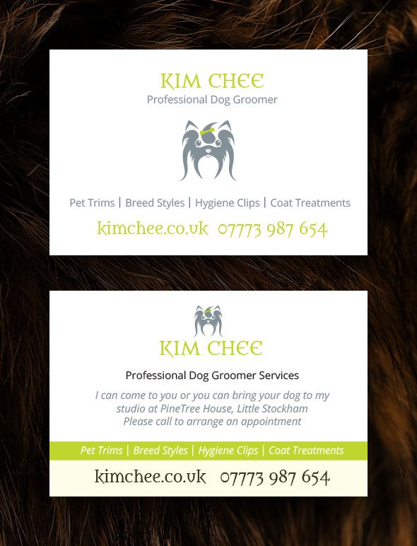
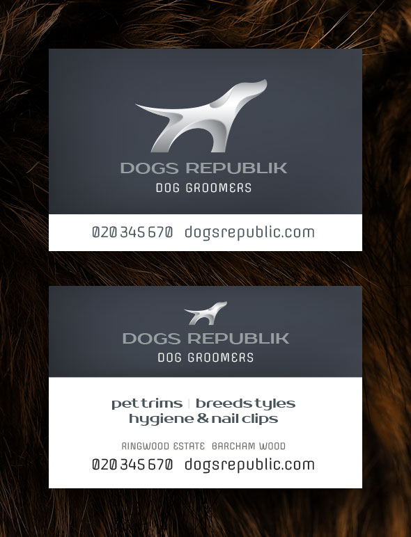
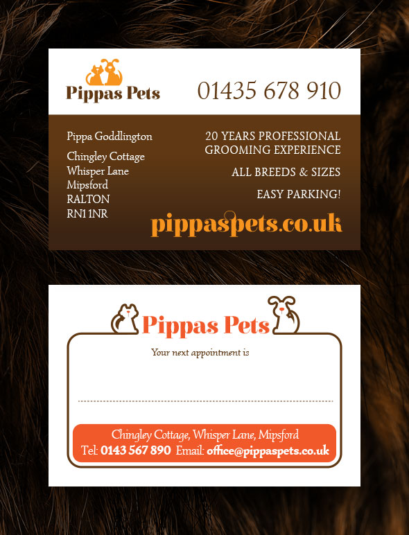
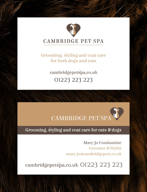
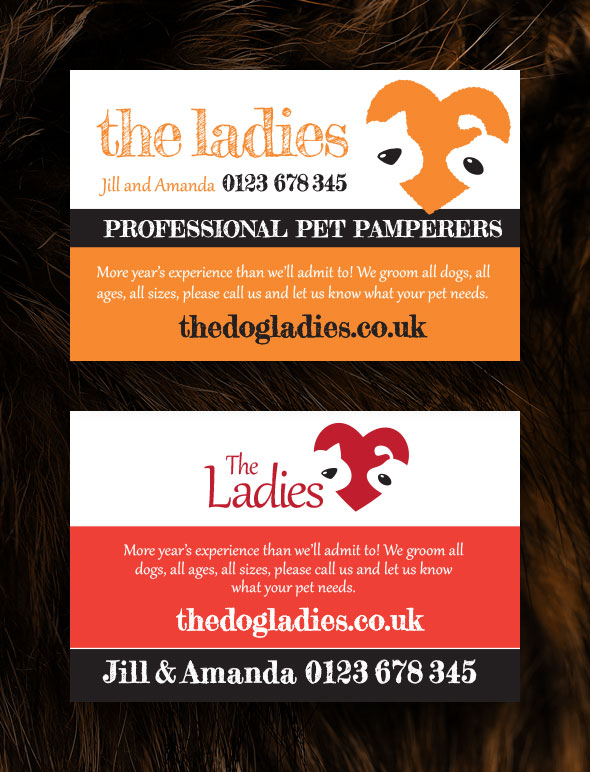
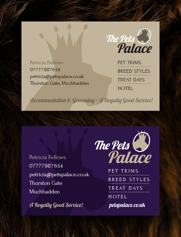
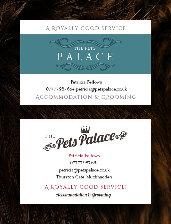
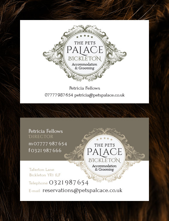
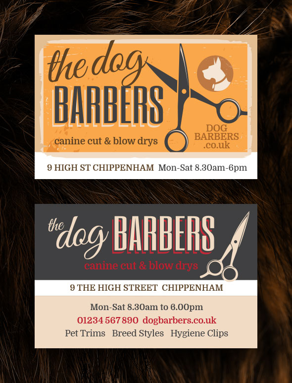
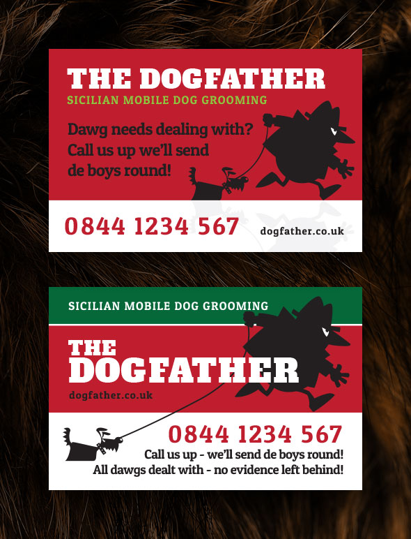
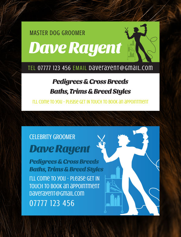
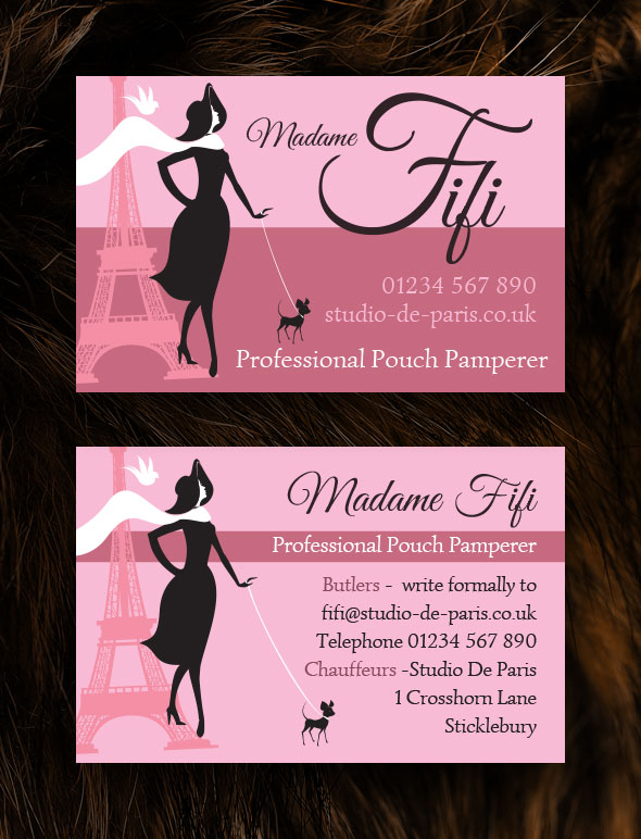
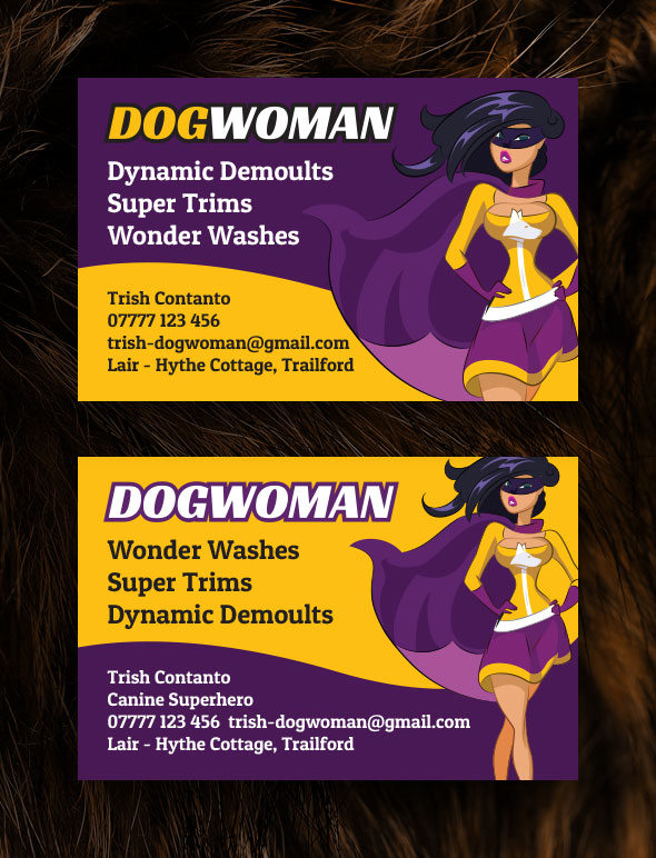
Choosing the right business card design can be tricky
Here are 40 examples you can study for inspiration
I’ve put together a range of designs all based on grooming businesses. I’ve made up the names (but I’m guessing that some may be in use already) and none of the details I’ve used relate to real businesses.
I’ve decided not to use photographic images and there are a couple of reasons for this:
1. Credibility
Bigger businesses never use photos – so I would be concerned that some people might think photos weren’t “professional” enough
2. Limiting Appeal
Picking a particular breed might appeal to some customers but not to others . . . and so it seemed a risk to use a photo of a particular breed
You’ll see that I’ve used varying amounts of text and I’ve tried to show that you don’t necessarily need personal contact detail – the choice is yours, there is no right and wrong and your favourites probably won’t me mine! Hope you find some inspiration!
[box style=”rounded” ]
TOP TIPS FOR YOUR OWN DESIGNS
Here a few basic pointers you can consider when you have your own cards designed
Make sure type is readable
It must be a reasonable size and should be a good contrast against the background (so don’t use white text on a yellow background, for example)
Make sure contact details are clear
Phone numbers and website addresses need to be easily visible – I’d suggest the test should be, if someone pins your card on their noticeboard is the phone number clear enough?
Think about what information should appear
You’ve usually got a front and back – so think about what info’s needed where. Make sure it’s clear what you do on the front of the card – so if you offer a range of services then it’s a good idea to feature them, or at least mention the types of service you provide.
[/box]

